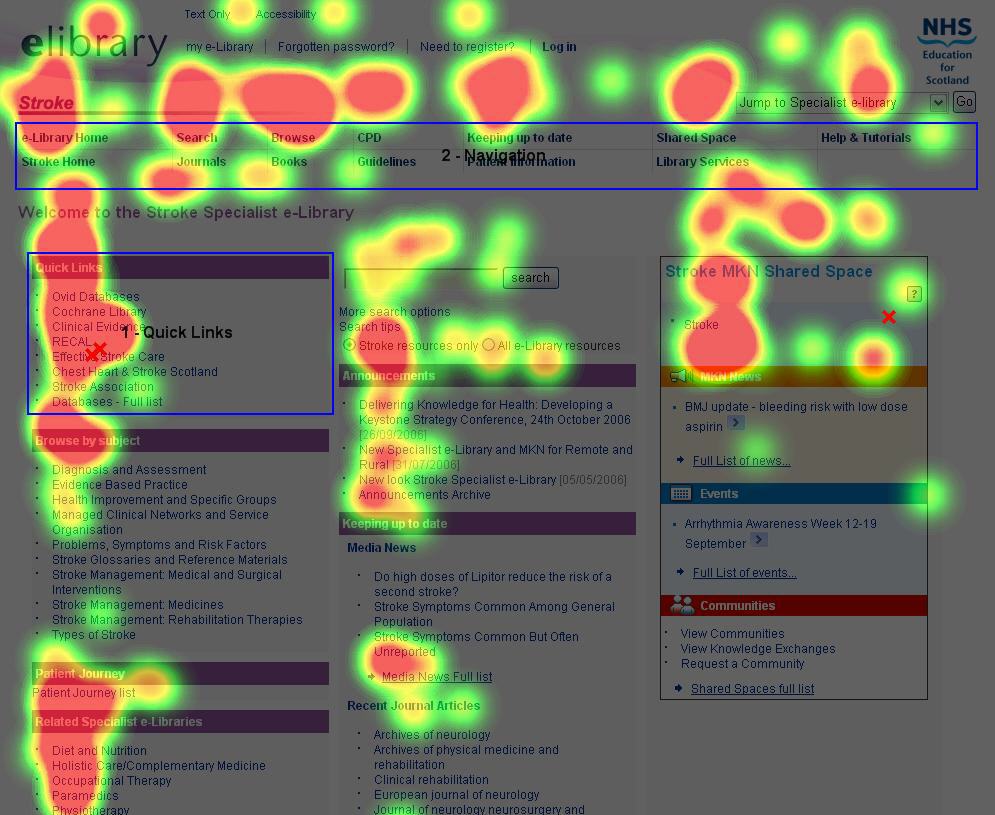
Analyze the heat map for better CTR and sales conversions
The best SEO can get visitors to your site but if you don’t have a navigation system in place that they can easily use, you could be losing visitors before they find more usable, digestible content on your site. Creating navigation bars is an art unto its own, specifically for the top, sidebars and bottom, and incorporating them into individual pages. While most everyone in the Western world reads top left to bottom right, that’s not always the best layout for navigation for your sites viewers, so spending time to analyze how your visitors use your site can be invaluable.
Google Analytics has heat maps built into their statistics software; several other free and paid site visitor-tracking services also provide similar information. Essentially they will show you on any give page what hyper-links are receiving the most clicks by visitors, both internal and outward bound. You don’t need a degree from Harvard to read these maps and it’s a good idea to check them every month or so in case visitor trending is changing.
By evaluating where your site visitors are clicking it’s easier as a designer to design the site’s navigation and even the layout of the content to help coax visitors to specific pages and ensure that the pages of your site they want to visit are easily found. One of the most stunning discoveries is just how useful a drop down menu can be, or how detrimental it can be to the success of a site. Depending on the target age demographic and niche of the site, a drop-down menu allows lots of information to be neatly and easily kept towards the top of a site, hover over one button and a menu falls revealing more choices. Younger, more technical savvy web browsers embrace this clean navigation, however older generations tend to click on the button that deploys the drop down menu, often before the menu is even deployed. Analyzing your heat maps could change how the entire navigation of your site is designed.
Likewise, if your site tends to require vertical scrolling, placing key navigation in the footer and / or an anchor tag linked to a top or up button that takes the visitor to the top of the page can be invaluable. Designing the layout and navigation of any site is a mix of aesthetics, displaying content and allowing your visitor to read, digest and continue onto other portions of the site. Deciphering the heat map of how your visitors view each page could lead you to make some very minor tweaks resulting in drastically higher page views!
Another great post on heatmaps and heat-mapping tools can be found here: 8 Heatmap Tools and Why / How to use them

