How Your Favorite Social Sites Looked In Past
The past of social media is a sad and depressing place like that of a closed down psychiatric ward. Bland colors and terrible bold neon looking letters. For giggles were going to show you some of these wonderful, spectacular and amazing websites back in time and how they have shaped up since.
To start it off you can see how great Digg was looking back when they started off in good ol’ 2k5!
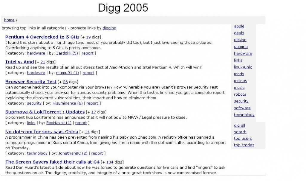
Since then Digg has clearly spiced it up a bit and brough in spiffy buttons and nice shiny ads.
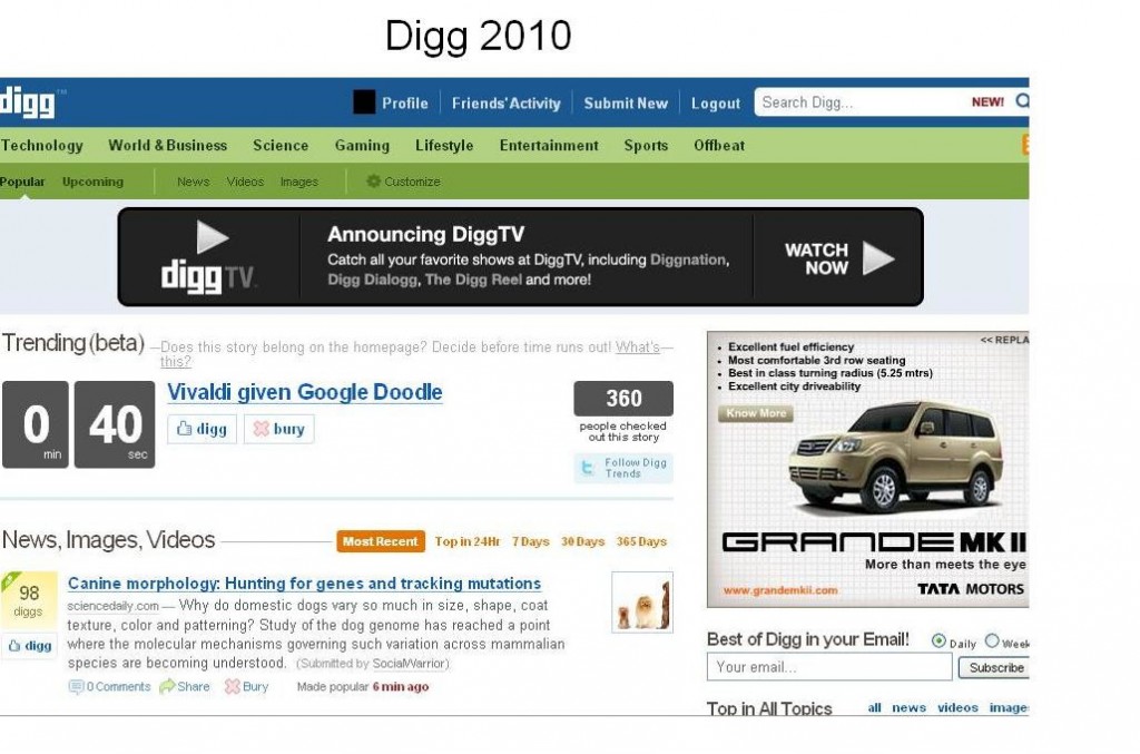
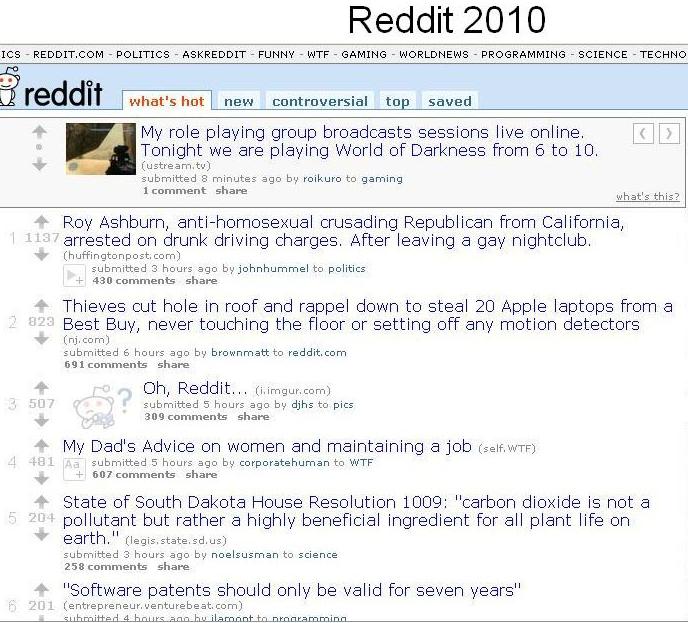
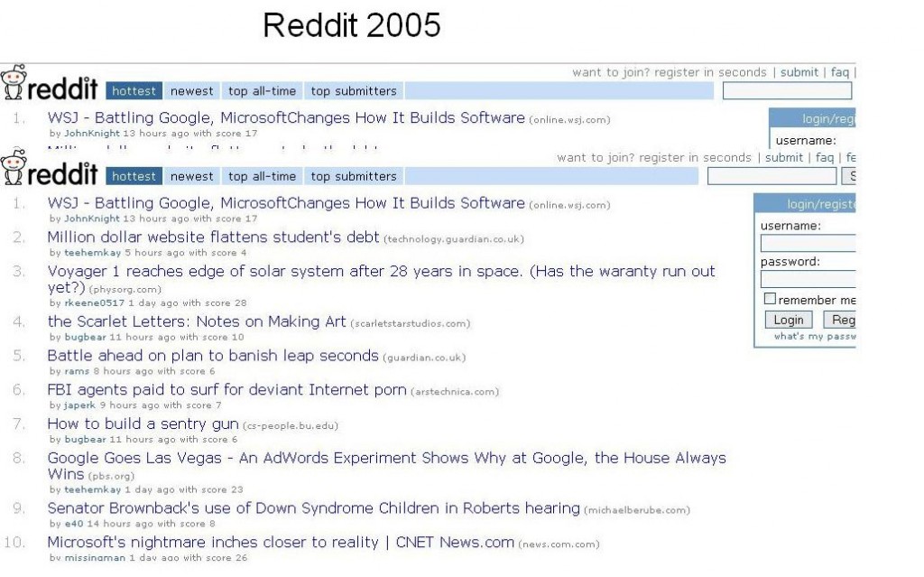
Reddit hasn’t really changed much. Guess for them the more simple the better which seems to be working very well for them so far.
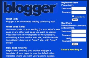
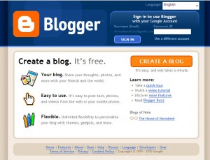
Blogger seems to be starting off pretty boring til Google got ahold of it and did work with the nice buttons and slick gradients.
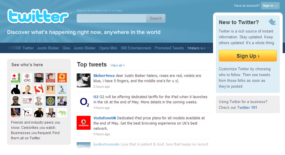
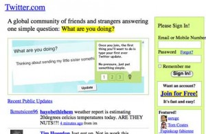
Twitter starting off looking the best of all in my humble opinion with the text overlapping divs, nice sun yellow gradients coming off the text and the wonderful eye burning blue links.
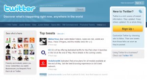
Now looking fresher than ever twitter has a good looking logo and promoted tweets! Never thought I’d see the day people would be shelling out big bucks for such short status updates.
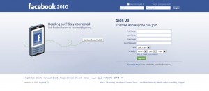
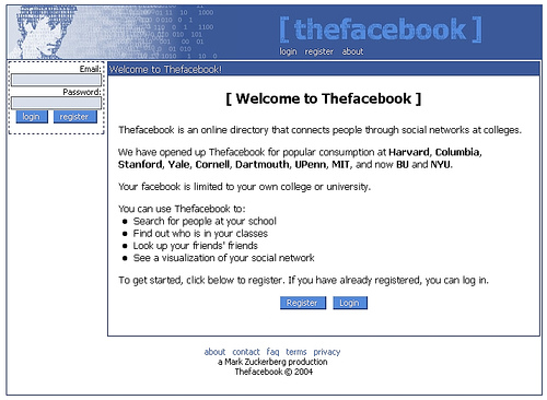
Facebook or [thefacebook] started off very easy to understand and simple. Minus the enormous list of new facebookees I’d say it looked pretty descent.
Today if you sign on Facebook you’re getting 100+ new group invitations, 5 new friend requests, grandma tagged naked baby bathtub pics and your girlfriend listed you as in an open relationship. Getting completely overloaded Facebook should maybe revert and drop back to the good days.
